Yet another 2020's food controversy. Currently the RDA of protein is 0.8 g/KG of body weight. Some say it is too low, especially if active.Others say that most Americans are getting adequate amounts of protein, but specific needs may vary from individual to individual. And those pushing high intake may have ulterior motives. Then there's the plant vs. animal sources debate. One side says we need animal protein for optimal absorption. Then there's another camp that says plant sources of protein are just fine. This guy (who has a PHD in nutrition) says animal sources are ideal, but vegan sources are okay, though there are nuances. Last, we have a doctor who says IGF-1 in animal sources can be potentially harmful to our health.
The FCC plans to vote on repealing local TV ownership limits, including the 39% national audience cap that currently restricts how much of the U.S. market a single broadcast group can reach. Engadget reports: On August 6, commissioners will hold a ballot to repeal Section 303 of the Communications Act, and with it the 39 percent rule. In essence, the rule limits the reach of a local TV network to no more than 39 percent of the U.S.' total audience market. In its place, the FCC would move to a system whereby it would personally approve or reject TV ownership deals on a case-by-case basis.
It's not clear if the FCC even has the authority to reject Section 303 without the explicit consent of the legislature. As Lawrence J. Spiwak wrote in the Yale Journal on Regulation back in January, Section 10 of the Communications Act expressly forbids the FCC from bending the rules around Section 303. "Americans no longer trust the legacy national media to report the news fairly or accurately," wrote FCC Chairman Brendan Carr in an op-ed published on Breitbart. "In fact, only eight percent of Americans have a great deal of trust in mass media. That figure is even lower among Republicans -- sitting at a mere three percent."
"... Many local broadcast TV stations are getting hollowed out as a result and turning into little more than mouthpieces for programming produced in New York and Hollywood," he alleged. "That is not what Congress or the FCC intended."


It's not clear if the FCC even has the authority to reject Section 303 without the explicit consent of the legislature. As Lawrence J. Spiwak wrote in the Yale Journal on Regulation back in January, Section 10 of the Communications Act expressly forbids the FCC from bending the rules around Section 303. "Americans no longer trust the legacy national media to report the news fairly or accurately," wrote FCC Chairman Brendan Carr in an op-ed published on Breitbart. "In fact, only eight percent of Americans have a great deal of trust in mass media. That figure is even lower among Republicans -- sitting at a mere three percent."
"... Many local broadcast TV stations are getting hollowed out as a result and turning into little more than mouthpieces for programming produced in New York and Hollywood," he alleged. "That is not what Congress or the FCC intended."
Read more of this story at Slashdot.
An anonymous reader quotes a report from Ars Technica: Big changes are coming to Android apps, but they're not the changes Google wanted. The settlement between Google and Epic that aimed to put to rest the companies' long-running antitrust battle is being withdrawn, and that means third-party app stores are coming to the Play Store. Google has confirmed that it will begin distributing rival app stores next week, setting the stage for competing platforms to take a bite out of Google's Android revenue stream. [...] Google and Epic were set to return to court on July 16 to argue in favor of the settlement. However, the writing may have been on the wall. In a recent expert analysis provided to the court, MIT economics professor Nancy Rose noted that the settlement was "unlikely to enable Google Play's potential competitors to overcome their long-standing network-effect disadvantage in a timely manner."
With settlement approval looking increasingly unlikely, Epic and Google agreed this week to call the whole thing off. Here's how Google Trust and Reputation Communications Lead Dan Jackson explains the company's decision: "We've agreed with Epic to withdraw our motion to modify the US Court's injunction rather than prolonging this process which creates uncertainty for the ecosystem. This allows us to focus on executing our recently announced global business model evolution to deliver greater app store choice, lower prices, and more opportunities for developers and users. We remain committed to maintaining Android's industry-leading security and fostering a competitive ecosystem where every app store and developer has the freedom to compete. In parallel, we continue to comply with the US Court's injunction."
In a brief filing (PDF), Google's legal team informs the court that Google is prepared to begin distributing third-party app stores in Google Play on July 22. Under the terms of Judge Donato's original injunction, these stores will have access to the full catalog of Google Play apps by default. Developers will have the option to opt out of distribution in these stores, and Google has a support page explaining how to do so. Google also has documentation on how app stores can get access to the Google Play catalog. It won't be mirroring those apps in any shady storefront that asks. The court has allowed Google to charge reasonable fees to cover its security and compliance review of third-party stores, which will be $5,000 per year.
Google will also require approved stores to block malware, respect intellectual property, and include mechanisms to update and uninstall apps. App stores can be removed from the program if more than 1 percent of attempted app installs appear to be malware or unwanted software. It's unclear if there will be separate, possibly more stringent requirements for storefront distribution in the Play Store. However, Google is prohibited from unreasonably blocking third-party store clients uploaded to Google Play. The changes Google has announced under the Epic agreement will proceed for now. That means Registered App Stores will happen globally, but they will probably only appear in the Play Store for US users. Google hasn't specified if there will be any differences in the features available to the stores downloaded from Play versus registered stores.
With settlement approval looking increasingly unlikely, Epic and Google agreed this week to call the whole thing off. Here's how Google Trust and Reputation Communications Lead Dan Jackson explains the company's decision: "We've agreed with Epic to withdraw our motion to modify the US Court's injunction rather than prolonging this process which creates uncertainty for the ecosystem. This allows us to focus on executing our recently announced global business model evolution to deliver greater app store choice, lower prices, and more opportunities for developers and users. We remain committed to maintaining Android's industry-leading security and fostering a competitive ecosystem where every app store and developer has the freedom to compete. In parallel, we continue to comply with the US Court's injunction."
In a brief filing (PDF), Google's legal team informs the court that Google is prepared to begin distributing third-party app stores in Google Play on July 22. Under the terms of Judge Donato's original injunction, these stores will have access to the full catalog of Google Play apps by default. Developers will have the option to opt out of distribution in these stores, and Google has a support page explaining how to do so. Google also has documentation on how app stores can get access to the Google Play catalog. It won't be mirroring those apps in any shady storefront that asks. The court has allowed Google to charge reasonable fees to cover its security and compliance review of third-party stores, which will be $5,000 per year.
Google will also require approved stores to block malware, respect intellectual property, and include mechanisms to update and uninstall apps. App stores can be removed from the program if more than 1 percent of attempted app installs appear to be malware or unwanted software. It's unclear if there will be separate, possibly more stringent requirements for storefront distribution in the Play Store. However, Google is prohibited from unreasonably blocking third-party store clients uploaded to Google Play. The changes Google has announced under the Epic agreement will proceed for now. That means Registered App Stores will happen globally, but they will probably only appear in the Play Store for US users. Google hasn't specified if there will be any differences in the features available to the stores downloaded from Play versus registered stores.
Read more of this story at Slashdot.

How AI will change the way scientific computing is done remains an open question. One relies on ultra-precise double-precision mathematics, while the other is perfectly happy working with 4 bits. On the surface, the two are diametrically opposed, two extremes of a spectrum we call high-performance computing (HPC) — and yes, whether you like it or not, AI is HPC. However, the latest AI offering from Cadence Design Systems, one of the biggest names in industrial HPC, offers a glimpse of how high- and low-precision compute could not just coexist, but work together to solve bigger and more complex problems faster and with fewer resources. Announced on Wednesday, Cadence’s AuraStack is an agentic AI system built to assist electrical engineers to design and test printed circuit boards (PCBs), or conduct advanced packaging design and testing — two tasks that have historically relied on highly precise simulations. AI is definitely a big piece of what Cadence has built; however the company isn’t replacing these tools with hallucination-prone AI models. Instead, AuraStack is a bit like Anthropic’s Claude Code or OpenAI’s Codex, but rather than writing, compiling, debugging, and running C or Rust in a sandbox, Cadence’s latest agent is designed to orchestrate its existing test and simulation suites. “AI is amplifying the value of our engineering products and technologies,” Michael Jackson, CVP of Cadence’s system design and analysis division, told The Register. In other words, the AI model — we’re told AuraStack integrates with a wide range of open and proprietary models — functions as a natural language interface capable of planning and orchestrating complex multi-step circuit design and testing workflows that run at higher precision using CPUs, GPUs, and other accelerators. “For example, if I'm going to check and fix the IR reliability, I need to identify the power management components. I need to create a simulation-ready power tree, and then I need to do the simulation, and then I need to provide feedback to the designer,” Jackson said. Cadence's existing product stack already automates many of these processes. The problem, Jackson explains, is that a PCB or package design often requires completing thousands of tasks throughout its development. “Sixty-five percent of an engineer's day is spent navigating and dealing with a lot of these tasks,” he said. By orchestrating that scutwork, Jackson claims that AuraStack can deliver a 15x boost to productivity by letting the designer focus on design and engineering decisions rather than the individual tasks. These gains are enough that several large players in the electronics space, including Nvidia, have already signed up for the service. Cadence isn’t just melding AI with HPC for chip design or advanced packaging. The engineering software provider has built similar agents for digital and analog chip design. The idea of using low precision compute to run AI models that orchestrate more precise single- and double-precision physics simulations isn’t new. Nvidia is one of the biggest champions of this approach, which makes sense seeing as its GPUs aren’t limited to training and running AI models, even if that’s what most folks are buying them for these days. Earlier this year, we explored how researchers at the Department of Energy’s Sandia National Laboratories used AI agents to develop and test new hypotheses. They described the system as a self-driving lab. However, those tests, while similar in concept to what Cadence is doing with AuraStack, didn’t use LLMs and instead used more mature architectures like variational auto-encoders. But given the success of code assistants, it’s not hard to imagine agent harnesses similar to AuraStack being used to automate lab equipment, perform simulations, and then iterate on the results, enabling scientists to continue their research even after they’ve nodded off for the night. ®


Nicholas Rougeux, whose work I have featured here before, has published a complete digital edition of William Jardine’s 40-volume book series on natural history published in the early-to-mid 19th-century. As part of the project, Rougeux restored each of the more than 1300 illustrations in the library, and the results are fantastic.






Rougeux wrote a post on the history of The Naturalist’s Library and how the project came about.
The Library is credited with having a significant democratizing effect on the study of natural history because Jardine and Lizars prioritized affordability and portability. Each book was only 4 by 6 inches and priced at six shillings, making them a much more accessible alternative to the “unwieldy folios” from other naturalists. This led to a tremendous demand for each one, resulting in tens of thousands of copies being printed overall. Just two years into publication, a notice appears at the beginning of one volume stating, “we have sold upwards of 60,000 volumes, in which there have been nearly 2,400,000 coloured plates given as Illustration.” Exact sales numbers are difficult to come by but history has shown that the series was very popular with estimates of 10,000 copies sold for each volume, totaling at least 400,000.
In order to help with his research, he borrowed a biography of Jardine from the library and built a custom rig out of K’nex construction toy pieces to scan the whole thing.

About a month later, I discovered a 2001 biography about Jardine, Sir William Jardine: A Life in Natural History, which only existed as a physical copy. I emailed the publisher to ask for a digital copy but had no luck. So I did what any self-respecting researcher would do and borrowed it on an inter-library loan and made my own digital copy by building a very janky custom rig out of old K’nex parts to take pictures of each page with my phone that I later combined into a searchable PDF. The OCR on it could be improved but having it available digitally allowed me to consult it in my research.
You can check out the shop for posters of the illustrations as well as a complete, bound, 800-page volume of all 1300+ illustrations.

Tags: art · books · design · illustration · Nicholas Rougeux · science · The Naturalist’s Library
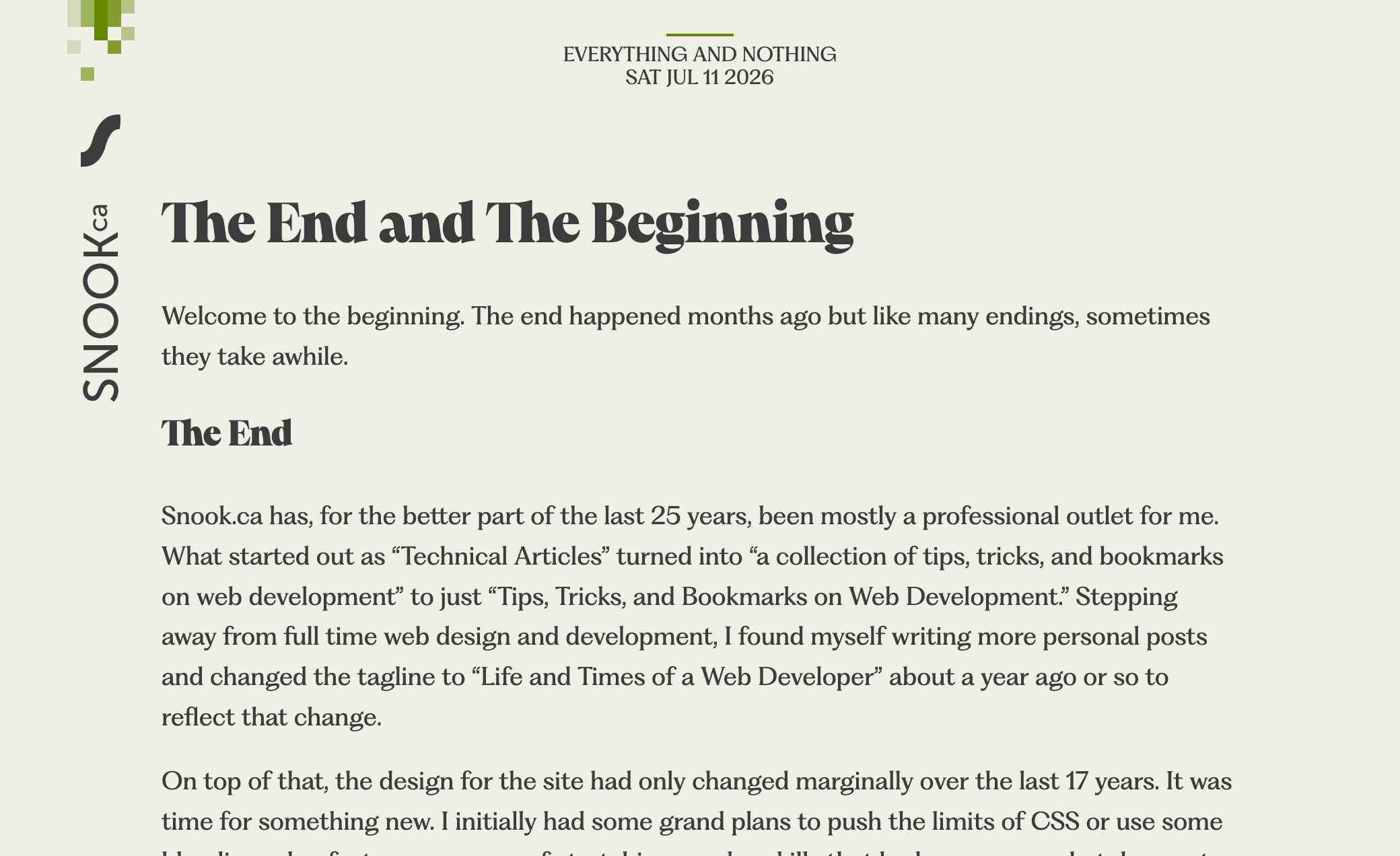
A week ago, I had launched this site using QuatroSlab for page titles and Google’s Slabo for body copy. For those that have been around awhile and are familiar with SMACSS, you might recognize QuatroSlab from that site. I like the font and started off with it to see how I’d feel about it on the this new design. Then I chose Slabo as a font that I felt paired well with it.
For the most part, I was fine with it but after finally getting a blog post written and posted under the new design, I was feeling less than thrilled with my choices.
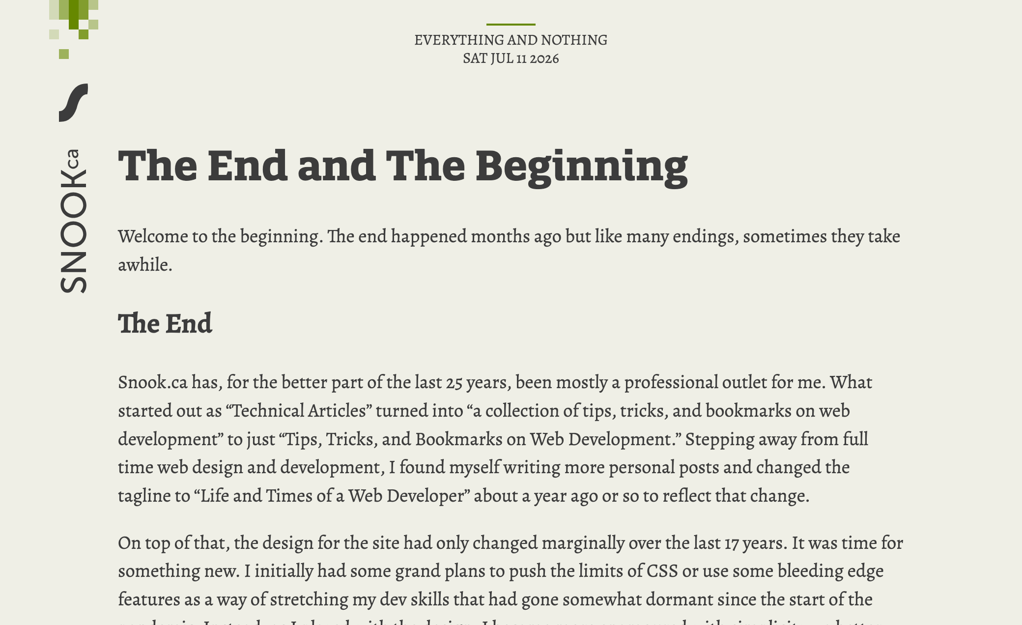
Over yesterday and today, I decided to do some research on fonts and came across Pangram Pangram Foundry. They have some delectable fonts that make me want to do some interesting designs with them. This led me to Fragment. I looked through all the variants and Fragment Text felt just right for the body copy. It felt softer and rounder and more open and friendly than Slabo.
My only complaint is that I want some of the discretionary ligatures in the list of standard ligatures like the Th and ft. The rest of them are too much flourish for body copy. I enabled the ligatures for headings, at least, where some flourish is warranted.
For page headings, though, I wanted something bolder. This is where Pangram Pangram’s Pangaia comes in. I like the slightly retro-modern funky feel that this font brings to the table.
The CSS
From a technical perspective, this is the first time I’ve taken advantage of OpenType feature capabilities and I found it confusing as I couldn’t find a good explanation of what liga or dlig or ss03 mean or how to know whether a font even supports these.
I’ve learned that you can turn these on or off via CSS’s font-feature-settings property.
font-feature-settings: "ss02", "ss03", "ss04", "dlig", "zero", "onum";
Declaring the value turns them on. You can alternatively, specifically declare them on or off using the words on or off or the numbers 1 or 0. The following would enable features ss02, ss03, zero, and onum; it would disable ss04 and dlig.
font-feature-settings: "ss02" on, "ss03" 1, "ss04" off, "dlig" 0, "zero", "onum";
The question then became about how to figure out which of these features exist in a particular font. For this, I used FontDrop!. It will show you what features are available and what those features look like for that font. FontDrop! is all client-side, too, which is nice. I didn’t want to be uploading files that aren’t mine to someone’s server.
Up Next
I suspect I will end up tweaking which of these features are on or off as I add more content to the site and decide what works well for a given scenario.